Planning a wedding is not an easy job. You must be mindful of a series of things to make everything perfect for the big day. One of the most crucial parts of your wedding is the way you invite your guests. To ensure that everyone you invite arrives at the venue of the celebration (or at least tries their best to do so despite adversities), you must come up with attractive and inviting wedding stationery.
Selecting the right color is typically the most difficult part of designing wedding stationery. There are innumerable colors to choose from. You will have a tough time picking shades that are your favorite and will also be loved by the people you are looking to invite.
One of the easiest ways to end this misery is by checking your entire wedding palette before you start picking colors for your wedding stationery. A typical wedding palette should include three four to six colors. This means before you design your wedding stationery you must pick the kind of colors you will want to incorporate into the most special day of your life.
For more color ideas to make wedding invites look more attractive checking the samples on https://www.basicinvite.com/wedding/wedding-invitations.html.
Click here to see the table of contents
Take Inspiration from Your Wedding Dress
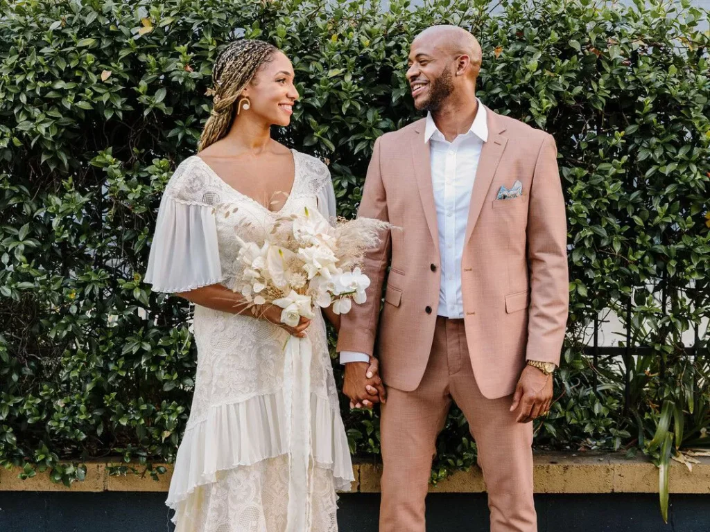
Source: theknot.com
The most common shades used for wedding dresses are white, gold, silver, cream, and ivory. According to experts, each of these colors works great even for stationery. Ideally, your wedding outfit’s color should be the inspiration for the shade of paper you pick for printing your wedding invites.
Here, you must remember that if you have opted for something quirky like a gray or an olive wedding dress, it would be a good decision to avoid picking paper of the same shade. That’s because gray or olive paper will make the design of the invite appear clumsy.
Match the Invite with the Color of the Groom’s Suit

Source: freepik.com
Grooms typically choose darker shades for their wedding suit. The most commonly used colors for the groom’s suit include gray, brown, navy, charcoal, and last but not least black. You can use all these colors in a wedding invitation design. These darker shades are usually suitable for the text color of the invites.
If the groom decides to wear a suit in a lighter shade, you can use the color for the paper of the stationery. Printing the content in light-colored ink wouldn’t be a wise decision.
Pick Colors from Your Wedding Venue and Setting
Source: pinterest.com
Find out which colors are most prominent in the wedding setting. Considering this factor is even more important if the event is taking place in an interesting and exciting location. For example, if you are planning to get married on an extravagant lawn, green will play a big role in the color palette of your wedding. On the other hand, couples getting married by the sea will have blue (the color of seawater) and white (the color of sand) as the primary colors on their wedding day.
You can use these colors for the paper, ink, or embellishments used to craft your wedding invitation. Depending on the wedding style you (classic, vintage, or modern) choose, you can decide how to incorporate these shades in the invitation.
The Color of Your Bridesmaid’s Gown
The color of the bridesmaid’s gown is usually picked according to the style of the wedding. Depending on the style, the color used for this special gown can be dark, light, and everything in between. If it’s a lighter shade, you can use stationery paper of the same color. Darker shades, on the other hand, can be used as the color of the ink used for the content and embellishments.
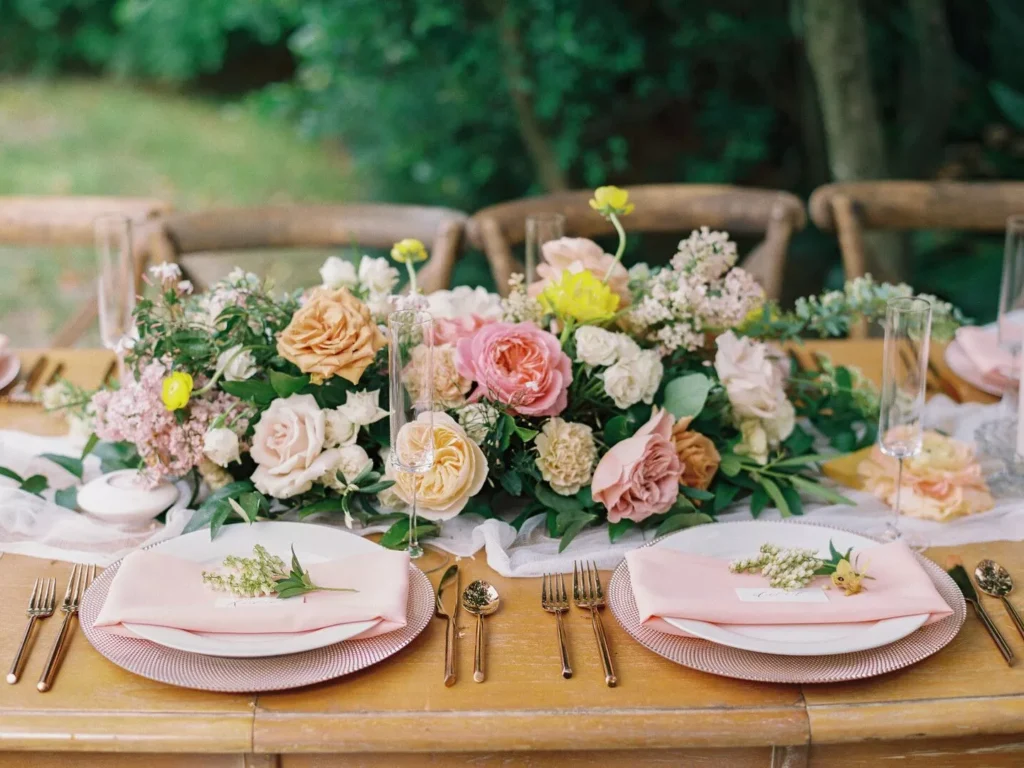
The Shades of Your Bouquet
The colors present in your bouquets can be the perfect inspiration for your wedding invites. More so, if the bouquet features just one kind of flower or flowers of a particular color. For instance, if you have picked pale pink roses for the bouquet, it would be a great color option for your wedding invite. Having a pale pink base for the invite will allow you to experiment with multiple ink colors.
The Colors You Pick Must Compliment Your Wedding Invitation Design
Following the above tips, will allow you to create a unique color palette for your wedding. Next, you must speak to a representative of the designing and printing house you are relying on for getting your wedding invites ready. Share the color palette with that person and he will help you in picking the right design for the wedding invitation.
To make the invitation look eye-catching you must look to include at least two to three colors in its design. However, make sure that you don’t end up adding too many colors. That would make it less readable and decrease its appeal.
Colors You Must Avoid When Designing Your Wedding Invite
ALL-black: You can obviously use black for printing the content of the invitation. However, it will not be wise to make black the most prominent color of your wedding stationery. Indeed, many modern-day couples often end up relying on black to make their wedding invites chic. However, that’s a choice of color you should avoid as black is the color of mourning.
Pale Brown: You will often come across wedding invites that have pale brown as the base color and have content written in gold or silver. You should avoid this design option as the combination of pale brown and gold/silver will make your wedding invitation look dull. It will fail to showcase the joy associated with the event.
Red: It’s okay to use red for your content. However, never opt for this shade for the paper used for printing the invitation. That’s because red, when not used wisely, can make printed items appear less sophisticated.
Final Words
You shouldn’t find it hard to pick the right colors for your wedding invitation if you follow the tips above. Additionally, you must also seek assistance from your designing and printing service provider when deciding on the colors.